Solution: Created ease of purchase for all users
A streamlined checkout flow with content transparency to help build credibility with users.
Kohler is an internationally renowned company best known for their kitchen & bath products. Kohler’s online checkout process suffered from a high amount of abandoned carts, products and a long payment flow.
I crafted a seamless experience, built on ecommerce best practices, that was enjoyable for both new & returning users. The result was fewer steps, increased content transparency, a large increase in both registered users and conversions.
Deliverables & Tasks
Digital audit & market analysis, ideation workshop, user flows and journey mapping, wireframes, clickable prototyping, stakeholder presentations and design documentation
Brand
Kohler
Role
UX Design Lead
My Contributions
- User Experience Design
- User Interface Design
- Content Strategy
- Wireframing
- User Flows & Journeys
- User Research & Testing
- Development Planning
01
04
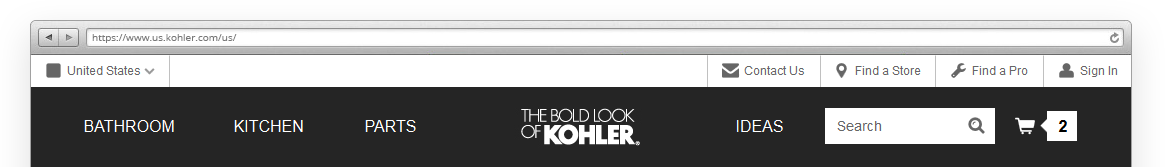
Simplified Navigation
With a few simple adjustments and organizing similar elements together, the main navigation became more intuitive and visually inviting. Using the logo to separate ecommerce elements from inspirational ones, grouping advanced elements (search and shopping cart) and creating a secondary support navigation I was able to create a better guide for suggested flow throughout the web environment.
02
04
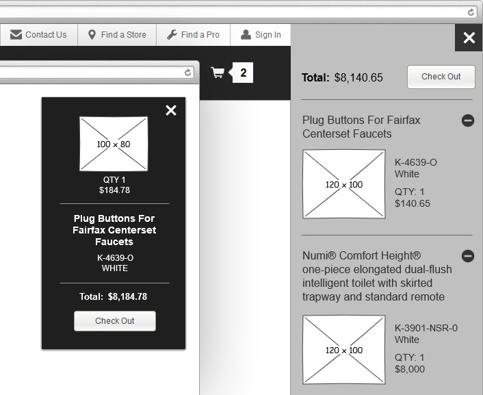
Cart Preview & Alerts
The shopping cart with counter was moved to the upper right side of the main navigation from its previous location in an intrusive ‘sticky’ footer at the bottom of the website. I also introduced an off-canvas menu to display cart items as consumers interacted with the shopping cart UI.
To elevate the confirmation communication as products are added to the cart, a fixed alert was introduced to display recently added items. This alert displays in the upper right side of the browser window.
03
04
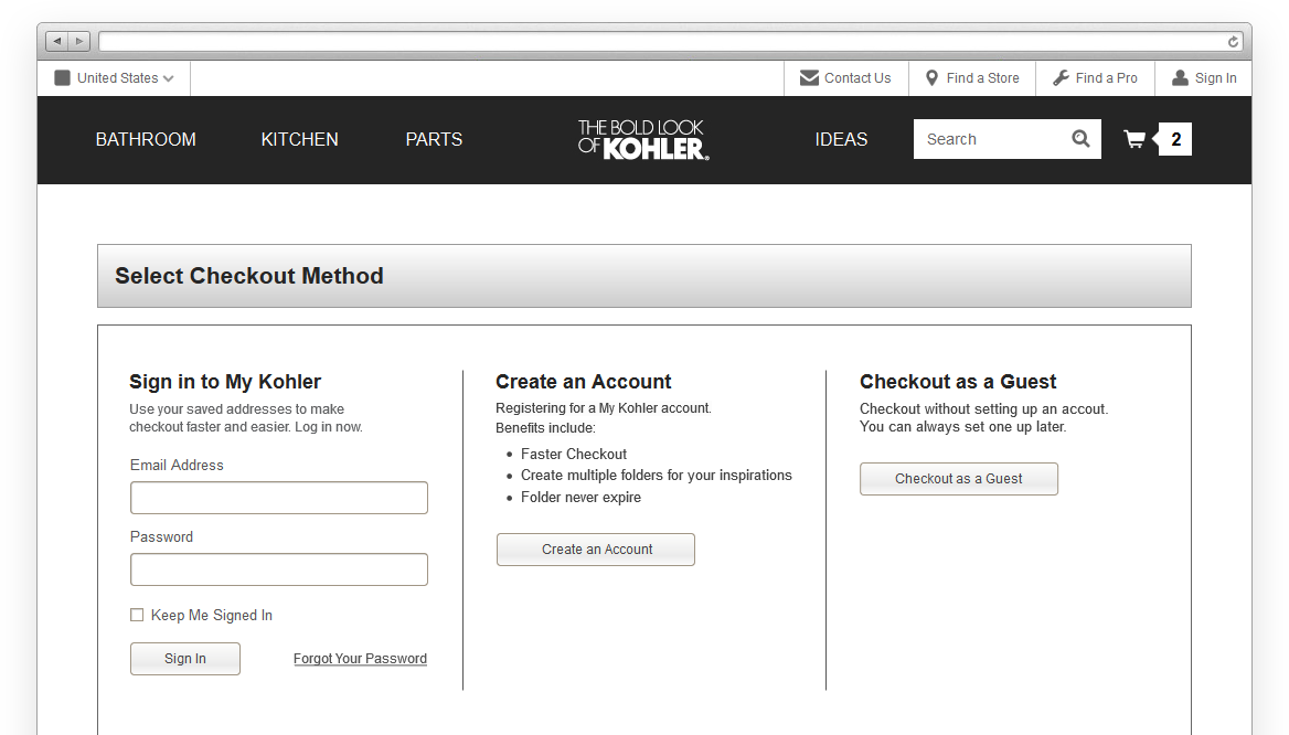
Introduction of Guest Checkout
Website metrics exposed a huge barrier of requiring users to either login or register to start the checkout process from the previous flow. As a result, a guest checkout option was introduced to help increase conversions for new and infrequent users. If users elected to checkout as a guest, we also included a clear communication of benefits for registering during the following steps to promote the value of joining the Kohler community.
04
04
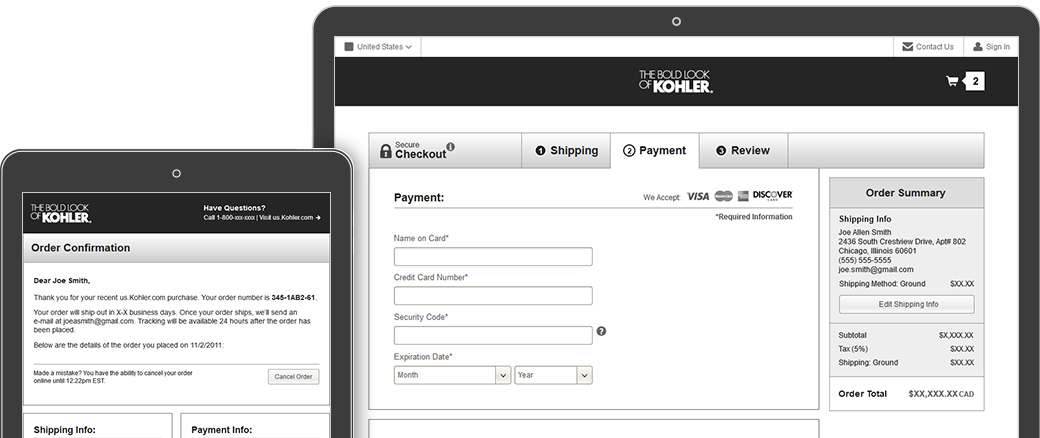
Updated Checkout Process
After reducing the amount of steps for the checkout process and making the entire flow more forgiving it resulted in more user registrations, increased conversions and less abandoned carts. Much of the redesign was based on best practices like, minimized navigation to help maintain focus during checkout, inline validation to reduce required user interactions and the addition of a review step prior to payment submission to only mention a few.
Although I didn’t have to provide any front or back-end development for this project, I did provide a comprehensive set of development specs to communicate with an off-site team. These specs included all desired interactive states, descriptions of all major functionality and features along with a clickable prototype prepared from the wireframes as a working guide.